One of the reasons I became a composer — or at least the kind of composer that I am — is that it's an excuse to pursue all of my different interests outside of music. A similar motivation led me to create SCAMP: I wanted to build a set of tools that let me connect different domains of knowledge with musical processes.
In the summer of 2021, it finally occurred to me to that it might be exciting to work directly with scientists, giving life to their data through sound. By chance, one of the first people I reached out to — Stanford biology professor Elizabeth Hadly — turned out to be the perfect person to approach with such an idea. Dr. Hadly leads the Lab of the Anthropocene at Stanford, and believes deeply in the role of the arts in science education and activism.
With generous support from the Burt McMurtry Arts initiative fund, Dr. Hadly, postdoctoral researcher Allison Stegner, and I collaborated on a composition for the Stanford New Ensemble and members of the Quinteto Latino, entitled Searsville 1891-2015.
What follows is a detailed account of how that piece was created. But first, here is the studio recording, alongside the graphic score:
For audio only, click here.
...and here is the presentation and premier of the work from May 2022:
For audio only, click here.
The Data
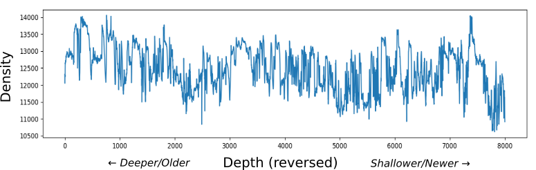
Searsville is based on data from sediment cores take from the Searsville Reservoir at Stanford’s Jasper Ridge Biological Preserve. The dam was constructed in the early 1890's, and ever since, there have been layers of sediment depositing at the bottom. This means that, by extracting a cylindrical core running from the top to the bottom, we essentially have a timeline of the last 125 years. Dr. Stegner has been leading a collaborative effort to analyze these cores from all sorts of different angles, looking at the presence of different atomic elements and isotopes over time, measuring the fluxuations in the density of the sediment, and counting different kinds of pollen embedded in the mud. As a record of human impacts on the environment, this site is of global importance, and is being considered as a candidate for formally defining the beginning of the Anthropocene.
For Searsville, we focused on two main sources of data: a CT scan, which shows fluxuations in the density of the sediment over time; and a subset of the pollen data, showing the rise and fall of different kinds of vegetation in response to human and non-human factors.
Seasonal Patterns: The Ensemble Part
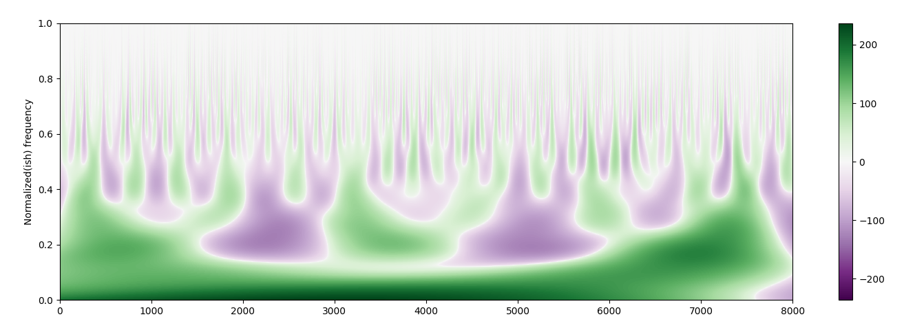
When there were storms in the Searsville area, the water rushing into the reservoir carried with it heavier rocks and minerals, leading to layers of denser sediment. By contrast, during times of relative calm, less-dense organic matter filtered down to the bottom of the lake. As a result, we can use the CT density scan to make inferences about seasonal patterns during period of time covered by the core. Here is a graph of that CT scan data, with the oldest/deepest layers of the core on the left and the newest/shallowest layers on the right:
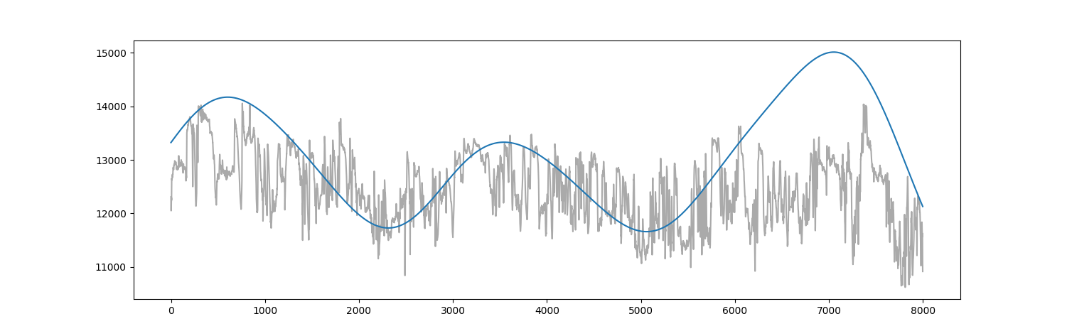
One of the things that interested me about this data was that it could potentially be analyzed at different scales. Could we separate out faster-changing seasonal fluxuations from the slower moving fluxuations of processes like el niño/la niña? To investigate this, I borrowed a technique I had explored some years ago: wavelet analysis!
Here are some of the slowest fluctuations I pulled out using wavelet analysis:
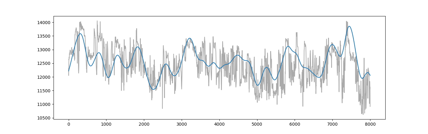
...and here are the medium-rate fluctuations:
...and here are the faster-rate fluctuations:
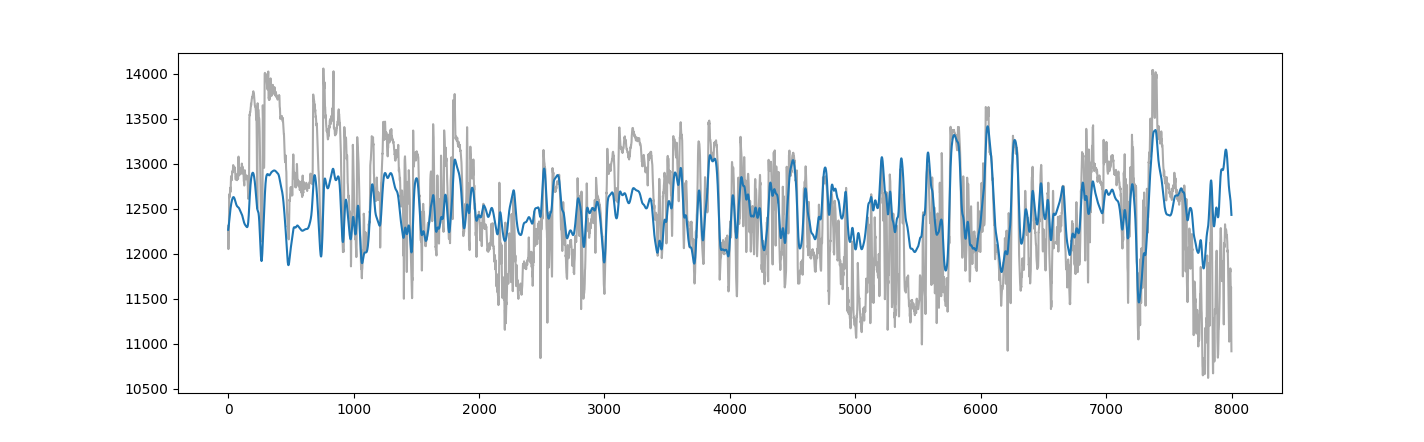
Now exactly what natural processes (seasonal variation, el niño/la niña) these correspond to is speculative, but there is clearly something being captured here about the many scales of cyclicality that exist in the natural world.
I can't resist one more visual. The whole wavelet analysis can be summed up in a colored graph like this, where the horizontal axis represents time, the vertical axis represents the scale of analysis, and the green and purple patches represent rising and falling fluxuations at different scales:
I even made a little animation showing the graphs that this image corresponds to as we move from larger to smaller scale and back:
Back to the Ensemble Music...
Perhaps that was a little too much detail. At any rate, I started to play with this. What if I mapped the different speeds of fluctuation to different layers of music and superimposed them. Could we get a sense of how these different scales of weather changes interact? Here is one of my original demos, based on the faster- and medium-rate oscillations I extracted:
The rise and fall of the graphs is mapped to the speed of the notes played. The upper part is playing a faster moving part of the wavelet analysis (perhaps representing seasonal cycles), while the lower part is playing a slower moving part (perhaps El Niño/La Niña). So, for instance, a wet season during a dryer, La Niña period, would sound like a flurry of notes in the upper part while the lower part becomes more sparse. The opposite would be true of a dry season during a wet El Niño. And when you have a wet season coinciding with El Niño, both parts do a flurry of notes simultaneously.
I found these dynamics exciting, and decided this would be the basis of the music for the larger ensemble. In the final work, I used four different scales of oscillation, with the top two playing note flurries as before, and the bottom two holding sustained chords. I also allowed the harmony to slowly morph over time, to suggest that, although there is cyclicality, no two weather cycles are really the same. Finally, instead of notating all of the notes individually, I opted for an animated graphic score. Here is that score, synchronized with the recording of just the ensemble parts:
The Soloists: a Changing Ecosystem
So that's the backdrop performed by the larger ensemble. But what about the flute and clarinet soloists?
We wanted the soloists to represent living things, changing and adapting in response to the environment created by the more impersonal seasonal patterns of the ensemble. So naturally, we gravitated towards the pollen data, which was assembled by R Scott Anderson at Northern Arizona University.
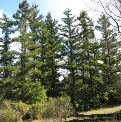
For every slice of the core, pollen from different kinds of vegetation were counted. There were so many kinds, but we narrowed our focus to five: California Redwood (Sequoia Sempervivens), Douglas Fir (Pseudotsuga), Willow (Salix), Oak (Quercus), and Alder (Alnus). Below are the (smoothed and processed) graphs for each type of pollen that I used in the composition, along with pictures of each. As before, the horizontal axis represents depth, with the bottom/oldest part of the core on the left and the top/youngest part on the right.
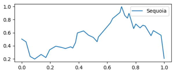

California Redwood (Sequoia Sempervivens)
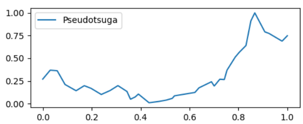
Douglas Fir (Pseudotsuga)
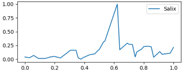
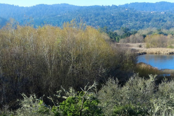
Willow (Salix)
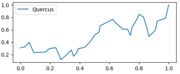
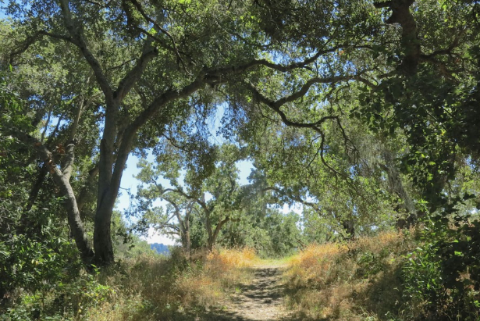
Oak(Quercus)
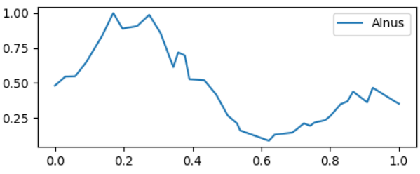
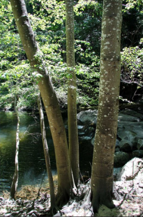
Alder (Alnus)
Each was chosen because of a story it tells about human activity: Redwood and Douglas Fir had been heavily logged prior to the building of the dam, and we see a gradual increase as they rebound from that logging. The species of Alder represented here likes wet environments, and the building of the dam created a marshy environment in which it thrived. Then, as sediment began to fill in the reservoir, it created a delta in which short, brush like Willows began to crowd out the Alders. (This is one of the more dramatic moments in the pollen record, because the Willows emerge and decline very quickly.) Finally, the increase in Oak and Oak Woodland habitat is likely connected to human land use, perhaps the changes caused grazing livestock.
To represent these trends musically, we assigned each type of pollen a musical gesture, or rather a family of musical gestures, with lower and higher intensity versions for each. I thought it was important to make these gestures distinct from one another — some using long, sustained notes; others using faster, staccato gestures — so that the changing balance of vegetation over time would lead to a gradually evolving musical texture in the solo parts. We also enlisted the help of volunteers at the Jasper Ridge Herbarium, who provided adjectives (such as “vibrant”, “cool”, or “stalwart”) for each type of pollen, which I used to further guide my musical choices.
Here are examples of the gesture families for each type of pollen — notice how there are more and less active versions for each:
Having created all of these gestures I wrote a program to sprinkle them throughout the composition, using their respective pollen curves as probability distributions. I also placed more active versions of the gestures where the pollen was more prevalent in the core, and less active versions where it was less prevalent.
After generating some messy notation in this way, I went through the score by hand and wove the gestures together, like this:
The following video, which syncs the recording with an animated graph of pollen prevalence, can give you a sense of how the balance of different types of pollen is reflected in the musical texture. The balance changes slowly, so try skipping around to different parts of the video:
You can see the full score of the music for the soloists here.
Putting it All Together
In the final form of the composition, the music for the soloists and the music for the Stanford New Ensemble are played simultaneously, so that dynamics of the living elements of the ecosystem (the soloists) can be heard within the context of the abiotic elements (the ensemble). Over the course of the piece's 12 minute duration, both progress together from the deepest, oldest parts of the sediment core to the shallowest, youngest parts.
A final challenge here was figuring out how to to keep the soloists coordinated with the ensemble, whose timing was fixed, pegged to the animated score. A simple approach might have been to use a click track, but I'm not a huge fan of click tracks when the goal is to create music that is supposed to breathe naturally.
Ultimately, my solution was to create this cue score, showing the soloists which rehearsal mark they should be on at any given time:
The beauty of this is that they can play naturally, and if they drift a little bit, they can always compensate by playing a bit slower or faster, or changing the duration of the rest.
Final Thoughts: Data and Storytelling
Throughout this project, Allison, Liz and I often talked about the role of storytelling in data and music. One of the striking things to me about the data was just how confounded it was, with so many overlapping chains of causation. When (as I sometimes do) I build and make music from a physics simulation, I'm working with a simplified and artificially tidy model. But this data came directly from the dirt, and so was the result of a panoply of different interacting processes, at all different geographical and temporal scales.
For example, when we see the brief spike in willow pollen, we have to ask ourselves whether this was truly a sudden and dramatic event, or simply an artifact of the particular place that the sediment core was taken, or of the relative resilience of willow pollen as compared with other vegetation. And does this kind of willow even reproduce quickly enough to create a spike that arrives and departs so quickly? (In this case, it turns out that the answer is yes, that it's quite plausible, and that the spike is reproduced in other cores taken from a very different spot in the upper reservoir.)
As an artist, I want to tell a compelling story: to select, process, and map the data in such a way that the listener can perceive clear trends, and be moved by them. But in doing so, am I artificially tidying up reality? In trying to connect listeners with the data, am I actually giving them a falsely sanitized version?
Interestingly, these concerns aren't unique to data-based art or music. On multiple occasions, Liz and Allison pointed out to me that they are inherent to the process of scientific interpretation. Every decision about how to describe, contextualize and visualize data involves judgments about the kinds of stories you want to tell.
I hope that in this work we achieved a balance: that the editorial choices we made in selecting and mapping the data served to make the work compelling, but that the wild, untamable nature of the data comes across as well. I also hope that, even where the music fails to be completely faithful to the data in a technical sense, it succeeds in a poetic sense: that you can feel, viscerally, the passage of time and the shifting cycles of nature.